单个数据库用腻了?多数据库“组合拳”带你打开免疫浸润新思路!


 |
公众号后台回复“111”领取本篇代码、基因集或示例数据等文件;
文件编号:240115
果粉福利:生信人必备神器——服务器
平时生信分析学习中有要的小伙伴可以联系小果租赁,粉丝福利都是市场超低价格,赶快找小果领取免费的试用账号吧!
load(paste0(datapath,"estimate_ped_pdx.RData")) ped <- estimate_ped_pdx[ estimate_ped_pdx$group != "TCGA",]tab <- as.data.frame(table(ped$cohort), stringsAsFactors = F)tab <- tab[order(tab$Freq, decreasing = T),] ped$cohort <- factor(ped$cohort, levels = tab$Var1)ped$group <- factor(ped$group, levels = c("CBTN", "ICGC", "TARGET", "PDX (ITCC)"))fig1a <- ggplot(data = ped) + geom_bar(aes(y = cohort, fill = group)) + myaxis + myplot +theme(axis.title = element_blank(), axis.text.x = element_text(size = 25, angle = 0, hjust = 0.5),legend.position = c(0.8,0.9), legend.title = element_blank(), plot.margin = margin(1,1,1,1, "cm")) +scale_fill_manual(values = group_col)pdf(file = paste0(plotpath,"Fig1_A.pdf"),width = 10, height = 10, useDingbats = FALSE)fig1adev.off()
 |
emptyvar <- as.data.frame(matrix(ncol = 7, nrow = 2))colnames(emptyvar) <- colnames(estimate_ped_pdx)emptyvar$group <- as.character(emptyvar$group)emptyvar$cohort <- as.character(emptyvar$cohort)emptyvar[1,”aliquot_id”] <- “empty1”emptyvar[2,”aliquot_id”] <- “empty2”emptyvar[1,”sample_id”] <- “empty1”emptyvar[2,”sample_id”] <- “empty2”emptyvar[1,”ImmuneScore”] <- 3500emptyvar[2,”ImmuneScore”] <- 3500emptyvar[1,”cohort”] <- “EMPTY1”emptyvar[2,”cohort”] <- “EMPTY2”estimate_ped_pdx <- rbind(estimate_ped_pdx,emptyvar)#计算ESTIMATE免疫评分estimate_ped_pdx$percread <- 8.0947988*exp(estimate_ped_pdx$ImmuneScore*0.0006267)immune.cohorts <- cbind(NA, unique(estimate_ped_pdx$cohort))colnames(immune.cohorts) <- c("group","cohort")immune.cohorts <- as.data.frame(immune.cohorts)immune.cohorts$group <- as.character(immune.cohorts$group)adults <- c("PRAD", "LGG", "OV", "SKCM", "COAD", "GBM", "LUAD")peds <- c("PDX","ETMR", "MB", "ATRT", "EPN", "pedHGG", "CP", "NBL", "pedLGG", "CPH", "MNG", "SCHW", "NFB")immune.cohorts[immune.cohorts$cohort %in% adults, 1] <- "Adult"immune.cohorts[immune.cohorts$cohort %in% peds, 1] <- "Pediatric"immune.cohorts[immune.cohorts$cohort == "EMPTY1",1] <- "Pediatric"immune.cohorts[immune.cohorts$cohort == "EMPTY2",1] <- "Pediatric"
for(i in 1:nrow(immune.cohorts)){ immune.cohorts$median_immunereads[i]<-median(estimate_ped_pdx$percread[estimate_ped_pdx$cohort == immune.cohorts$cohort[i]])}#对肿瘤的类型进行排序tmp <- immune.cohorts[which(immune.cohorts$group == "Pediatric"),]tmp1 <- immune.cohorts[which(immune.cohorts$group == "Adult"),]immune.cohorts <- rbind(tmp,tmp1)immune.cohorts$cohort <- factor(immune.cohorts$cohort, levels = c("PDX","ETMR", "MB", "ATRT", "EPN", "pedHGG", "CP", "NBL", "pedLGG", "CPH", "MNG", "SCHW", "NFB", "EMPTY1","EMPTY2", "PRAD", "LGG", "OV", "SKCM", "COAD", "GBM", "LUAD")) immune.cohorts <- immune.cohorts[order(immune.cohorts$cohort),]# 调用Splot 对数据进行处理,准备绘图disease.width <- (nrow(estimate_ped_pdx)/nrow(immune.cohorts)) sorted.estimate_ped_pdx <- estimate_ped_pdx[0,]start = 0for(i in 1:(nrow(immune.cohorts))){ tmp <- estimate_ped_pdx[estimate_ped_pdx$cohort == immune.cohorts$cohort[i],] tmp <- tmp[order(tmp$percread),] #create range of x values to squeeze dots into equal widths of the plot for each Disease regardless of the number of samples div <- disease.width/nrow(tmp)#If there is only one sample, put the dot in the middle of the alloted spaceif(dim(tmp)[1]==1) { tmp$Xpos<-start+(disease.width/2) } else tmp$Xpos<-seq(from = start, to = start+disease.width, by = div)[-1] sorted.estimate_ped_pdx<-rbind(sorted.estimate_ped_pdx,tmp) immune.cohorts$Median.start[i] <- tmp$Xpos[1] immune.cohorts$Median.stop[i] <- tmp$Xpos[nrow(tmp)] immune.cohorts$N[i]<-nrow(tmp) start <- start+disease.width+30}immune.cohorts$medianloc <- immune.cohorts$Median.start+((immune.cohorts$Median.stop-immune.cohorts$Median.start)/2) sorted.estimate_ped_pdx$cohort <- factor(sorted.estimate_ped_pdx$cohort, levels = levels(immune.cohorts$cohort))rmEMPTY <- rep("black",22)rmEMPTY[14:15] <- "white"immune.cohorts$color_crossbar <- NAimmune.cohorts$color_crossbar[immune.cohorts$cohort == "EMPTY1"] <- "white"immune.cohorts$color_crossbar[immune.cohorts$cohort == "EMPTY2"] <- "white"immune.cohorts$color_crossbar[is.na(immune.cohorts$color_crossbar)] <- "black"immune.cohorts$cohort_n <- paste0(immune.cohorts$cohort, " (n=", immune.cohorts$N, ")")#绘制图片fig1b1.fx <- function(x){ggplot() +geom_point(data = sorted.estimate_ped_pdx, aes(x = Xpos ,y = percread, color = cohort),size = 7, shape = 20) +geom_crossbar(data = immune.cohorts,aes(x = medianloc,y = median_immunereads, color = color_crossbar,ymin = median_immunereads,ymax = median_immunereads), width = disease.width) +myaxis + myplot +theme(axis.title.x = element_blank(), axis.title.y = element_text(size = 25),axis.text.x = element_text(size = 25, angle = 45, hjust = 1, color = rmEMPTY),axis.text.y = element_text(size = 25)) +scale_color_manual(values = c(cohort_col, "white" = "white", "black" = "black"), guide = "none") +scale_x_continuous(breaks = seq((disease.width)/2,max(sorted.estimate_ped_pdx$Xpos),disease.width+30), labels = immune.cohorts$cohort_n, expand = c(0,20)) +scale_y_continuous(breaks = seq(0, 70, by = 10)) +labs(y = "% Immune Reads")}fig1b <- fig1b1.fx(sorted.estimate_ped_pdx)pdf(file = paste0(plotpath,"Fig1_B.pdf"),width = 20, height = 8, useDingbats = FALSE)fig1bdev.off()
 |
load(file = paste0(datapath,"metadata_IC.RData"))load(file = paste0(datapath, "geneset_cc_normalized.RData"))
cluster_cohort <- metadata_IC[order(metadata_IC$immune_cluster, metadata_IC$cohort),]
mycluster <- as.character(cluster_cohort$immune_cluster)names(mycluster) <- rownames(cluster_cohort)cluster_hm <- class_hm.fx(mycluster)
mycohort <- cluster_cohort$cohortnames(mycohort) <- rownames(cluster_cohort)mycohorts <- t(as.matrix(mycohort))rownames(mycohorts) <- "Cohort"cohorts_hm <- cohorts_hm.fx(mycohorts)cells_mat <- geneset_cc_norm[,rownames(cluster_cohort)] cells_hm <- cells_hm.fx(cells_mat) annotation_order <- c("Pediatric Inflammed", "Myeloid Predominant", "Immune Neutral", "Immune Desert")cluster_ha = HeatmapAnnotation(clusters = anno_mark(at = c(50, 235, 566, 844), labels_rot = 0,labels = annotation_order, side = "top",labels_gp = gpar(fontsize = 20),link_height = unit(0.5, "cm")))fig1c <- cluster_ha %v% cluster_hm %v% cells_hm %v% cohorts_hm
lgd_cohort = Legend(labels = names(cohort_col)[2:13], title = "", nrow = 1, legend_gp = gpar(fill = cohort_col[2:13]))pdf(paste0(plotpath,"Fig1_C.pdf"), width = 18, height = 10)draw(fig1c, annotation_legend_side = "bottom", legend_grouping = "original", annotation_legend_list = list(lgd_cohort))dev.off()
 |
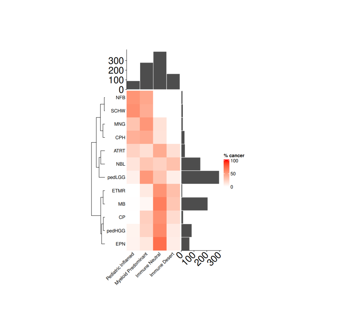
load(file = paste0(datapath,"metadata_IC.RData")) tab <- as.data.frame(table(metadata_IC$cohort), stringsAsFactors = F)tab <- tab[order(tab$Freq, decreasing = F),] cancer_IC_mat <- matrix(nrow = 12, ncol = 4, dimnames = list(tab$Var1, c("Pediatric Inflamed", "Myeloid Predominant", "Immune Neutral", "Immune Desert")))for(i in 1:nrow(cancer_IC_mat)){ mycancer <- metadata_IC[ metadata_IC$cohort == rownames(cancer_IC_mat)[i],] freq_tab <- as.data.frame(table(mycancer$immune_cluster), stringsAsFactors = F) freq_tab$perc <- freq_tab$Freq/sum(freq_tab$Freq) cancer_IC_mat[i, freq_tab$Var1] <- freq_tab$perc *100}cancer_IC_mat[is.na(cancer_IC_mat)] <- 0
row_dend <- as.dendrogram(hclust(dist(cancer_IC_mat), "complete"))row_dend <- dendextend::rotate(row_dend,c("NFB", "SCHW", "MNG", "CPH", "ATRT", "NBL", "pedLGG", "ETMR", "MB", "CP", "pedHGG", "EPN"))# 注释ha = rowAnnotation(`cohort size` = anno_barplot(tab$Freq, bar_width = 1,gp = gpar(col = "white", fill = "#4d4d4d"),border = FALSE,axis_param = list(at = c(0, 100, 200, 300), labels_rot = 45, gp = gpar(fontsize = 20)),width = unit(3, "cm")),show_annotation_name = FALSE)ha_1 = HeatmapAnnotation(`immune size` = anno_barplot( as.matrix(table(metadata_IC$immune_cluster)), bar_width = 1,gp = gpar(col = "white", fill = "#4d4d4d"),border = FALSE,axis_param = list(at = c(0, 100,200,300), labels_rot = 45, gp = gpar(fontsize = 20)),height = unit(3, "cm")),show_annotation_name = FALSE)
# 绘图col_fun= colorRamp2(c(0, 100), c("white", "red"))cancer_hm = Heatmap(cancer_IC_mat,#titles and namesname = "% cancer",show_row_names = TRUE,show_column_names = TRUE,#clusters and orderscluster_columns = FALSE,cluster_rows = row_dend,show_row_dend = TRUE,#aesthesticsrow_names_side = "left",col = col_fun,column_names_rot = 45,column_names_gp = gpar(fontsize = 10),row_names_gp = gpar(fontsize = 10), height = unit(nrow(cancer_IC_mat), "cm"),width = unit(ncol(cancer_IC_mat), "cm"),column_title_gp = gpar(fontsize = 10),column_title = NULL,row_title = NULL,right_annotation = ha,top_annotation = ha_1,show_heatmap_legend = TRUE)pdf(paste0(plotpath,"Fig1_D.pdf"),width = 10, height = 10)draw(cancer_hm)dev.off()
 |
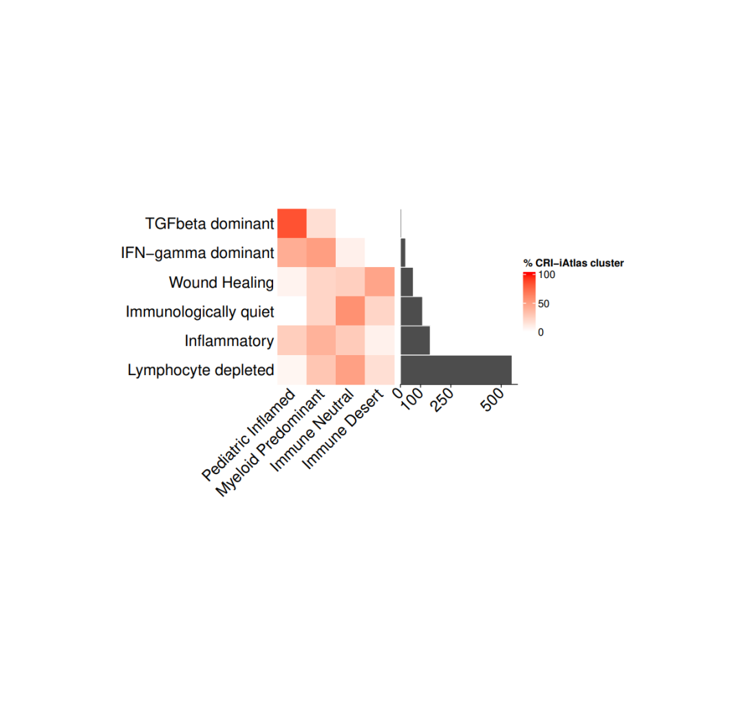
#导入数据load(file = paste0(datapath,"metadata_IC.RData"))tab <- as.data.frame(table(metadata_IC$CRI_cluster), stringsAsFactors = F)tab <- tab[order(tab$Freq, decreasing = F),]
#存储每个免疫集群和免疫簇的百分比cri_IC_mat <- matrix(nrow = 6, ncol = 4,dimnames = list(tab$Var1,c("Pediatric Inflamed", "Myeloid Predominant","Immune Neutral", "Immune Desert")))for(i in 1:nrow(cri_IC_mat)){mycancer <- metadata_IC[ metadata_IC$CRI_cluster == rownames(cri_IC_mat)[i],]freq_tab <- as.data.frame(table(mycancer$immune_cluster), stringsAsFactors = F)freq_tab$perc <- freq_tab$Freq/sum(freq_tab$Freq)cri_IC_mat[i, freq_tab$Var1] <- freq_tab$perc *100}cri_IC_mat[is.na(cri_IC_mat)] <- 0col_fun= colorRamp2(c(0, 100), c("white", "red"))#设置热图参数cri_hm = Heatmap(cri_IC_mat,#titles and namesname = "% CRI-iAtlas cluster",show_row_names = TRUE,show_column_names = TRUE,#clusters and orderscluster_columns = FALSE,cluster_rows = FALSE,show_column_dend = TRUE,#aesthesticsrow_names_side = "left",col = col_fun,column_names_rot = 45,column_names_gp = gpar(fontsize = 15),row_names_gp = gpar(fontsize = 15),height = unit(nrow(cri_IC_mat), "cm"),width = unit(ncol(cri_IC_mat), "cm"),column_title_gp = gpar(fontsize = 15),column_title = NULL,row_title = NULL,show_heatmap_legend = TRUE)ha = rowAnnotation(`cohort size` = anno_barplot(tab$Freq, bar_width = 1,gp = gpar(col = "white", fill = "#4d4d4d"),border = FALSE,axis_param = list(gp = gpar(fontsize=15), at = c(0, 100,250,500), labels_rot = 45),width = unit(4, "cm")),show_annotation_name = FALSE)pdf(paste0(plotpath, "Fig1_E.pdf"), width = 10, height = 10)cri_hm + hadev.off()
 |
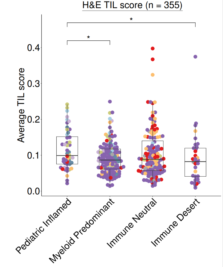
#导入数据(HE评分)load(file = file.path(datapath,"HE_manifest.RData"))
#绘图heplot <- ggplot(data = HE_manifest,aes(x = immune_cluster, y = agg_tilScore)) +geom_beeswarm(cex = 1.5, aes(color = cohort), size = 5) +geom_boxplot(width = 0.5, outlier.colour = NA, fill = NA) +myaxis + myplot +scale_color_manual(values = cohort_col) +theme(legend.position = "none",plot.margin = unit(c(0.2,0.2,0.2,2), "cm"),axis.title.x = element_blank(),axis.title.y = element_text(size = 30),axis.text.x = element_text(size = 30),axis.text.y = element_text(size = 30),plot.title = element_text(size = 30, hjust = 0.5)) +geom_signif(comparisons = list(c("Pediatric Inflamed", "Myeloid Predominant")), y_position = 0.4,map_signif_level=TRUE, textsize = 10, test = "wilcox.test", vjust = 0.5) +geom_signif(comparisons = list(c("Pediatric Inflamed", "Immune Desert")), y_position = 0.45,map_signif_level=TRUE, textsize = 10, test = "wilcox.test", vjust = 0.5) +labs(y = "Average TIL score") + ggtitle(~underline("H&E TIL score (n = 355)"))pdf(paste0(plotpath,"Fig1_F.pdf"),width = 10, height = 12)print(heplot)dev.off()
 |
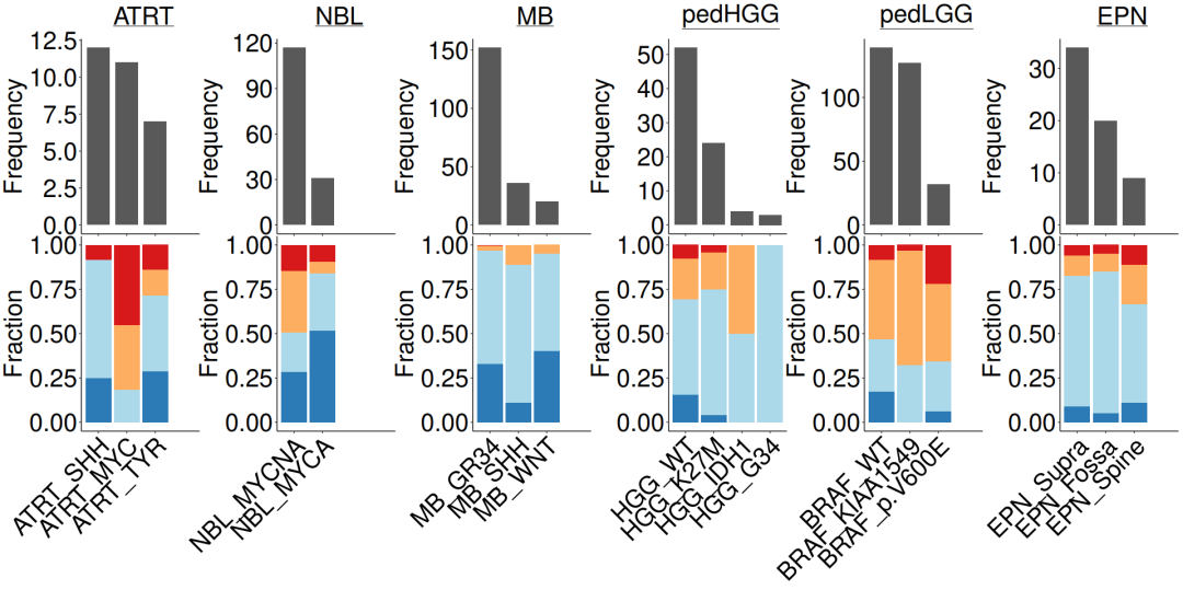
#导入数据load(file = paste0(datapath,"metadata_IC.RData"))n_x <- 4#lggp_c <- subgroupcount_IC.fx(metadata_IC, "pedLGG")lggp_f <- subgroupfreq_IC.fx(metadata_IC, "pedLGG")hggp_c <- subgroupcount_IC.fx(metadata_IC, "pedHGG")hggp_f <- subgroupfreq_IC.fx(metadata_IC, "pedHGG")nblp_c <- subgroupcount_IC.fx(metadata_IC, "NBL")nblp_f <- subgroupfreq_IC.fx(metadata_IC, "NBL")atrtp_c <- subgroupcount_IC.fx(metadata_IC, "ATRT")atrtp_f <- subgroupfreq_IC.fx(metadata_IC, "ATRT")mbp_c <- subgroupcount_IC.fx(metadata_IC, "MB")mbp_f <- subgroupfreq_IC.fx(metadata_IC, "MB")epnp_c <- subgroupcount_IC.fx(metadata_IC, "EPN")epnp_f <- subgroupfreq_IC.fx(metadata_IC, "EPN")#组合条形图c_ls = list(atrtp_c + ggtitle(expression(~underline("ATRT"))),nblp_c+ ggtitle(expression(~underline("NBL"))),mbp_c+ ggtitle(expression(~underline("MB"))),hggp_c + ggtitle(expression(~underline("pedHGG"))),lggp_c + ggtitle(expression(~underline("pedLGG"))),epnp_c + ggtitle(expression(~underline("EPN"))))f_ls = list(atrtp_f, nblp_f, mbp_f, hggp_f, lggp_f, epnp_f )#合并pdf(paste0(plotpath, "Fig1_G.pdf"),width = 20, height = 10, useDingbats = FALSE)wrap_plots(c(c_ls, f_ls), nrow = 2)dev.off()
 |


往期推荐