小图教你绘制高大上的热图!R包ComplexHeatmap热图神器的使用!!!
点击蓝字
关注小图
小伙伴想必对热图已经见了很多,普普通通的的热图已经满足不了小伙伴的“胃口”了。我们平时绘制热图目的就是要可视化数据,有效的可视化不同来源数据集之间关联并且去解释潜在的模式。而普通的热图我们已经很常见了,小图这里教大家如何绘制高大上的热图!!
这里就是使用目前一种绘制热图的神器R包ComplexHeatmap,它不仅仅可以绘制简单的热图,还可以绘制复杂的热图,那么接下来小图就带大家去学习吧!
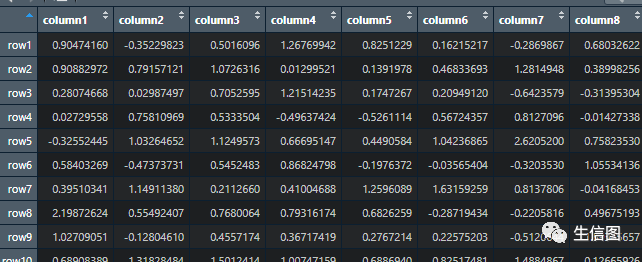
这里使用的数据呢,小图自己设定的,小伙伴可以按照格式自行去设置。
因为ComplexHeatmap这个包呢不会对数据标准话,而我们平时绘制数据时候,一般都需要将数据标准化,这里小图教大家,可以显示有scale()函数对数据标准化。
这里我们演示随机生成的正态分布的数据,是不需要标准化
set.seed(123)nr1 = 4; nr2 = 8; nr3 = 6; nr = nr1 + nr2 + nr3nc1 = 6; nc2 = 8; nc3 = 10; nc = nc1 + nc2 + nc3mat = cbind(rbind(matrix(rnorm(nr1*nc1, mean = 1, sd = 0.5), nr = nr1),matrix(rnorm(nr2*nc1, mean = 0, sd = 0.5), nr = nr2),matrix(rnorm(nr3*nc1, mean = 0, sd = 0.5), nr = nr3)),rbind(matrix(rnorm(nr1*nc2, mean = 0, sd = 0.5), nr = nr1),matrix(rnorm(nr2*nc2, mean = 1, sd = 0.5), nr = nr2),matrix(rnorm(nr3*nc2, mean = 0, sd = 0.5), nr = nr3)),rbind(matrix(rnorm(nr1*nc3, mean = 0.5, sd = 0.5), nr = nr1),matrix(rnorm(nr2*nc3, mean = 0.5, sd = 0.5), nr = nr2),matrix(rnorm(nr3*nc3, mean = 1, sd = 0.5), nr = nr3)))mat = mat[sample(nr, nr), sample(nc, nc)]rownames(mat) = paste0("row", seq_len(nr))colnames(mat) = paste0("column", seq_len(nc))
我们将上述数据先绘制简单的热图
Heatmap(mat)
其中Heatmap()该函数是将矩阵可视化为具有默认设置的热图。与其他热图工具非常相似,它绘制树状图、行/列名称和热图图例。默认颜色模式是“蓝-白-红”,它映射到矩阵中的最小-平均-最大值。图例的标题分配有内部索引号。
这是简单的热图,给大家演示一下,下面我们去修改颜色和标题
其中,对于颜色来说,可以使用circlize包中的colorRAMP2()函数来生成,来看一下把:
library(circlize)## 对 -2 和 2 之间的值进行线性插值以获得相应的颜色,大于 2 的值全部映射为红色,小于 -2 的值全部映射为绿色。col_fun = colorRamp2(c(-2, 0, 2), c("green", "white", "red"))Heatmap(mat, name = "mat", col = col_fun, column_title = "I am a column title",row_title = "I am a row title", column_title_gp = gpar(fontsize = 20, fontface = "bold"))
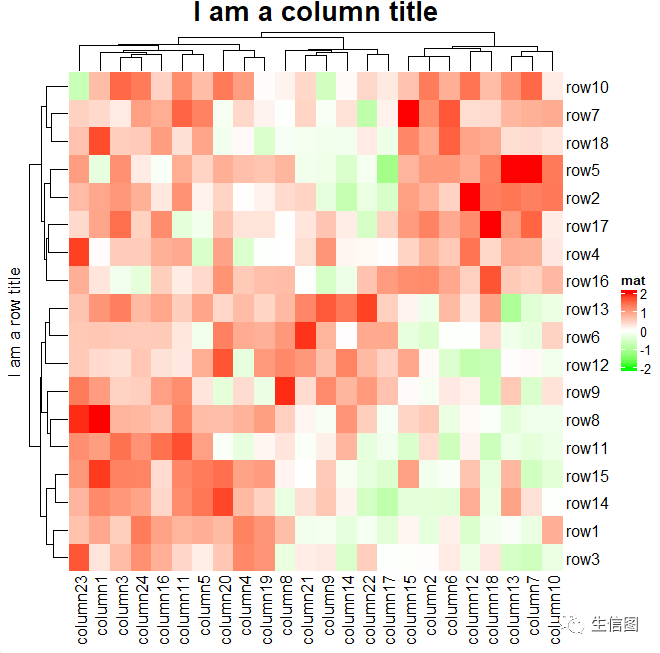
这样一来不同区域的颜色明显分离出来,上述参数中col是表示用于颜色映射的调色板函数,而columu_title表示列的标题,row_title是表示行标题,column_titile_gp表示设置列标题样式的图形参数。
接下里我们就看聚类
聚类在热图中可视化部分是很重要的,在ComplexHeatmap包中呢我们可以使用“euclidean”或”pearson”定于距离的聚类,而我们也可以使用不同颜色和样式去展示聚类后的树状图(这里我们就可以使用dendextend这个包,)。来看一下:
library(dendextend)#小图这里提示一下,这个包不是很好下,小图是在官方提供的R包下载,从外部导入,小伙伴要注意哦row_dend = as.dendrogram(hclust(dist(mat)))row_dend = color_branches(row_dend, k = 2)Heatmap(mat, name = "mat", cluster_columns = TRUE,show_column_dend = FALSE,clustering_distance_rows = "pearson",row_dend_side = "left",column_dend_side = "bottom",cluster_rows = row_dend)

这样一来是不是比平时的聚类树状图好看多了呢,上述参数呢小伙伴们可能不太理解,row_dend是将行聚类结果转化为树状图形式的聚类树。
Color_branches是对行聚类书中的分支进行颜色的区分。而cluster_columns是表示是否对列进行聚类,clustering_distance_rows是表示用于计算行聚类距离的距离度量方法.
下面呢我们还可以将热图进行分割,这个就是ComplexHeatmap包一个特色,对功能不同的进行分组来凸显功能,来试试吧:
printf("hello world!");## 通过聚类分割Heatmap(mat, name = "mat", row_km = 2, column_km = 3)
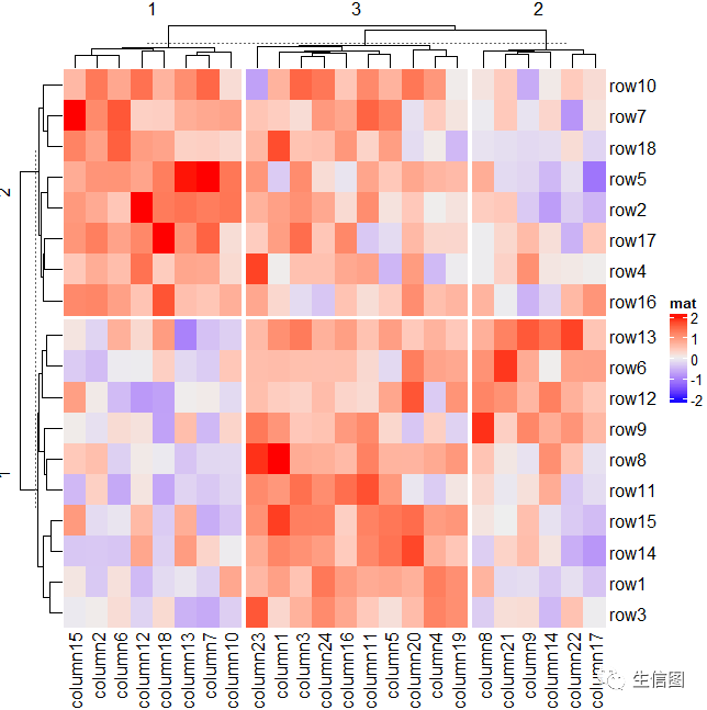
## 自定义分割Heatmap(mat, name = "mat", row_split = rep(c("A", "B"), 9), column_split = rep(c("C", "D"), 12))

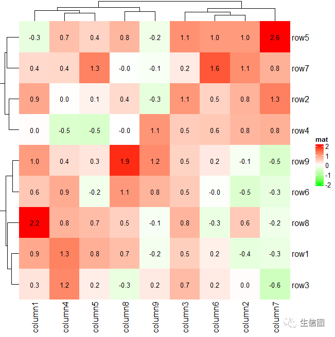
但是这样如图中也只是图片,我们还以在热图上添加数值:
small_mat = mat[1:9, 1:9]col_fun = colorRamp2(c(-2, 0, 2), c("green", "white", "red"))Heatmap(small_mat, name = "mat", col = col_fun,cell_fun = function(j, i, x, y, width, height, fill) {grid.text(sprintf("%.1f", small_mat[i, j]), x, y, gp = gpar(fontsize = 10))})
下面这个就有意思了,我们可以选择只为具有正值的单元格添加文本:
Heatmap(small_mat, name = "mat", col = col_fun,cell_fun = function(j, i, x, y, width, height, fill) {if(small_mat[i, j] > 0)grid.text(sprintf("%.1f", small_mat[i, j]), x, y, gp = gpar(fontsize = 10))})

我们绘制热图还可以显示去corrplot包类的相关矩阵:
cor_mat = cor(small_mat)od = hclust(dist(cor_mat))$ordercor_mat = cor_mat[od, od]nm = rownames(cor_mat)col_fun = circlize::colorRamp2(c(-1, 0, 1), c("green", "white", "red"))# `col = col_fun` here is used to generate the legendHeatmap(cor_mat, name = "correlation", col = col_fun, rect_gp = gpar(type = "none"),cell_fun = function(j, i, x, y, width, height, fill) {grid.rect(x = x, y = y, width = width, height = height,gp = gpar(col = "grey", fill = NA))if(i == j) {grid.text(nm[i], x = x, y = y)} else if(i > j) {grid.circle(x = x, y = y, r = abs(cor_mat[i, j])/2 * min(unit.c(width, height)),gp = gpar(fill = col_fun(cor_mat[i, j]), col = NA))} else {grid.text(sprintf("%.1f", cor_mat[i, j]), x, y, gp = gpar(fontsize = 10))}}, cluster_rows = FALSE, cluster_columns = FALSE,show_row_names = FALSE, show_column_names = FALSE)
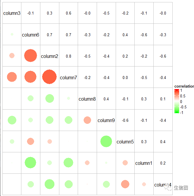
是不是很神奇,不需要corrplot包就绘制出类似的图
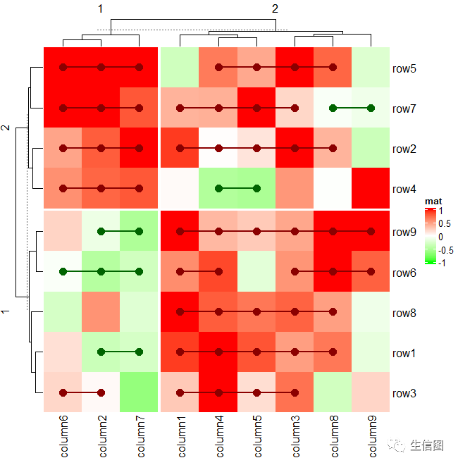
我们在热图上添加图层
eatmap(small_mat, name = "mat", col = col_fun,row_km = 2, column_km = 2,layer_fun = function(j, i, x, y, width, height, fill, slice_r, slice_c) {v = pindex(small_mat, i, j)grid.text(sprintf("%.1f", v), x, y, gp = gpar(fontsize = 10))if(slice_r != slice_c) {grid.rect(gp = gpar(lwd = 2, fill = "transparent"))}})

这个就有点类似分组。
不过还有一种方式去自定义参数图层,就是layer_fun函数可以自定义图层函数,我们看一下效果:
Heatmap(small_mat, name = "mat", col = col_fun,row_km = 2, column_km = 2,layer_fun = function(j, i, x, y, w, h, fill) {# restore_matrix() is explained after this chunk of codeind_mat = restore_matrix(j, i, x, y)for(ir in seq_len(nrow(ind_mat))) {for(ic in seq_len(ncol(ind_mat))[-1]) {ind1 = ind_mat[ir, ic-1]ind2 = ind_mat[ir, ic]v1 = small_mat[i[ind1], j[ind1]]v2 = small_mat[i[ind2], j[ind2]]if(v1 * v2 > 0) {col = ifelse(v1 > 0, "darkred", "darkgreen")grid.segments(x[ind1], y[ind1], x[ind2], y[ind2],gp = gpar(col = col, lwd = 2))grid.points(x[c(ind1, ind2)], y[c(ind1, ind2)],pch = 16, gp = gpar(col = col), size = unit(4, "mm"))}}}})
这个就很神奇了,这个就是在热图切片中的单元格之间进行交互。在对于热图中的每一行,如果相邻两列中的值具有相同的符号,我们根据两个值的符号添加一条红线或一条绿线。由于现在单元格中的图形依赖于其他单元格,这个功能值能通过layer_fun函数去实现。
上述就是热图的绘制,小伙伴有没有学会呢,这几种热图形式哪一种才是你的喜欢,小伙伴要注意多多理解代码的意义,才能绘制出自己想要的图片。
欢迎使用:云生信平台 ( http://www.biocloudservice.com/home.html)

|
往期推荐 |
|
|
|
|
|
|
👇点击阅读原文进入网址