小果带你认识R数据可视化之ggplot二维密度图
 小果在之前的文章中详细讲述了ggplot密度图的内容,并通过举例的方式带大家一起绘制了调整不同参数后的图片,那么今天小果要再进阶一下向小伙伴们介绍的是ggplot二维密度图的一些相关内容。在介绍之前小果还是先强烈推荐一下自己的工具平台
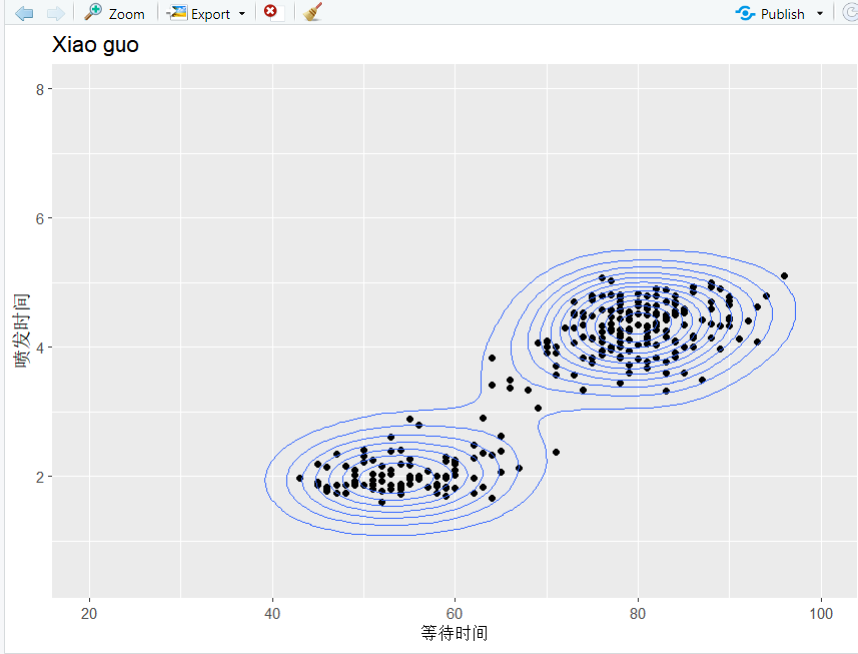
> p <- ggplot(faithful, aes(x = waiting, y = eruptions)) ++ geom_point() ++ ylim(0.5, 8) ++ xlim(20, 100) ++ labs(title = "Xiao guo", x = "等待时间", y = "喷发时间")> p + geom_density_2d()
> p + geom_density_2d_filled(alpha = 0.5) ++ geom_density_2d(size = 0.25, colour = "pink")

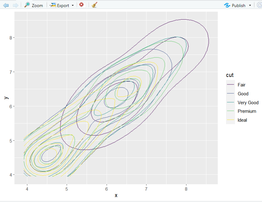
> d <- sample_n(diamonds, 500) %>%+ ggplot(aes(x, y))> d + geom_density_2d(aes(colour = cut))
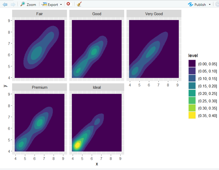
d + geom_density_2d_filled() ++ facet_wrap(vars(cut))
> N <- 1000> df <- tibble(+ x1 = rnorm(n = N, mean = 2),+ x2 = rnorm(n = N, mean = 2),+ y1 = rnorm(n = N, mean = 2),+ y2 = rnorm(n = N, mean = 2)+ )> top_hist <- ggplot(df, aes(y1)) ++ geom_density(fill = "pink", colour = "black") ++ theme_void() ++ labs(title = "Xiao guo")> right_hist <- ggplot(df, aes(y2)) ++ geom_density(fill = "pink", colour = "black") ++ coord_flip() ++ theme_void()> center <- ggplot(df, aes(y1, y2)) ++ geom_density2d(colour = "black") ++ geom_density2d_filled() ++ scale_fill_brewer(palette = "Set2") ++ theme(+ panel.background=element_rect(fill="white",colour="black",size=0.25),+ axis.line=element_line(colour="black",size=0.25),+ axis.title=element_text(size=13,face="plain",color="black"),+ axis.text = element_text(size=12,face="plain",color="black"),+ legend.position = "none"+ )> p1 <- plot_grid(top_hist, center, align = "v",+ nrow = 2, rel_heights = c(1, 4))> p2 <- plot_grid(NULL, right_hist, align = "v",+ nrow = 2, rel_heights = c(1, 4))> plot_grid(p1, p2, ncol = 2,+ rel_widths = c(4, 1))> glist <- list(top_hist, center, right_hist)

小果还提供思路设计、定制生信分析、文献思路复现;有需要的小伙伴欢迎直接扫码咨询小果,竭诚为您的科研助力!

定制生信分析
服务器租赁
扫码咨询小果


往期回顾
|
01 |
|
02 |
|
03 |
|
04 |