小果手把手教学-使用ggpubr进行文章的组图合并!
小伙伴在阅读生信文章的时候,肯定都见过许多精美的图片,而他们的图片中往往都是有许多个不同结果的图进行组合,这种是发表文献是,小伙伴必须需要学会的技能。多个图形进行组图的展示,可以让我们的结果可以多角度的展示出来,也可以进行结果差异比对的需求。
当然,我们平时用的最多的就是PS,AI软件处理,但是软件对图片中大小,位置,布局,文字等调整麻烦的很,也不是一个小工程。小果在这里教大家一个其他的方法,利用R包ggpubr进行组图的合并,或许比AI,PS更容易呢,小果从0开始给大家介绍,我们开始学习吧!
小果在这里教学用的数据都是来自R包中自带的数据集:
首先我们载入R包还有数据集:
公众号后台回复“111″,领取代码,代码编号:231002
install.packages("ggpubr")#这里注意的是 我们要首先载入ggplot2,在载入ggpubr包library(ggplot2)library(ggpubr)ToothGrowth数据集data("ToothGrowth")head(ToothGrowth)

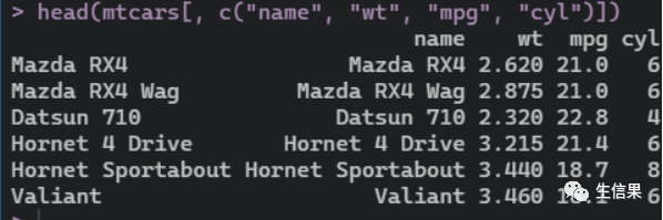
接下来是# mtcars 数据集data("mtcars")mtcars$name <- rownames(mtcars)mtcars$cyl <- as.factor(mtcars$cyl)head(mtcars[, c("name", "wt", "mpg", "cyl")])

我们主要学习的是组图,小伙伴对数据出的子图可以更具自己需求来完成。
我们先创建单个的图片
首先是箱线图:
Box_plot <- ggboxplot(ToothGrowth, x = "dose", y = "len",color = "dose", palette = "jco")Box_plot

接下里是点图#点图
Dot_plot <- ggdotplot(ToothGrowth, x = "dose", y = "len",color = "dose", palette = "jco", binwidth = 1)Dot_plot

然后是#有序条形图
Bar_plot <- ggbarplot(mtcars, x = "name", y = "mpg",fill = "cyl", # change fill color by cylcolor = "white", # Set bar border colors to whitepalette = "jco", # jco journal color palett. see ?ggparsort.val = "asc", # Sort the value in ascending ordersort.by.groups = TRUE, # Sort inside each groupx.text.angle = 90 # Rotate vertically x axis texts) + font("x.text", size = 8)Bar_plot
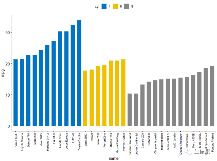
后面就是#散点图
Scatter_plots <- ggscatter(mtcars, x = "wt", y = "mpg",add = "reg.line", # Add regression lineconf.int = TRUE, # Add confidence intervalcolor = "cyl", palette = "jco", # Color by groups "cyl"shape = "cyl" # Change point shape by groups "cyl")+stat_cor(aes(color = cyl), label.x = 3) # Add correlation coefficientScatter_plots

上述的单图是不是都很熟悉,都是平时我们做的比较多的图,我们创建完成后,就开始绘制组合图片把
这里使用ggpubr包中函数ggarrange()在一页上进行展示上述的结果
对ToothGrowth数据集的箱线图,点图组合展示:
ggarrange(Box_plot, Dot_plot,labels = c(“A”, “B”),ncol = 2, nrow = 1)
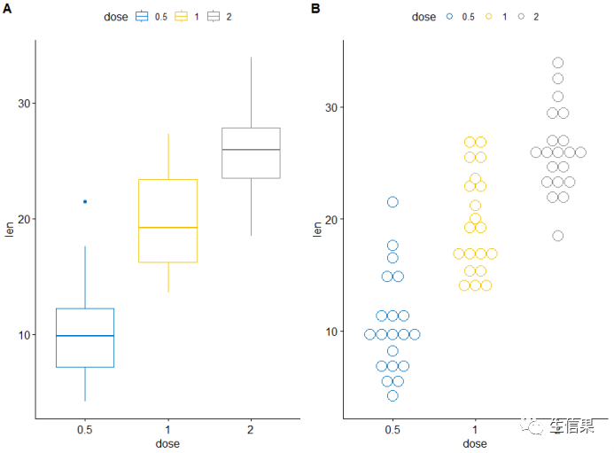
是不是就完成了呢,AB序号小伙伴可以自行调整
后面我们对#mtcars 数据集的条形图,散点图组合展示
figure <- ggarrange(Scatter_plots, Bar_plot + font("x.text", size = 10),ncol = 1, nrow = 2)#添加图形的注释信息(标题,副标题,坐标轴,字体,颜色等)annotate_figure(figure,top = text_grob("Visualizing mpg", color = "red", face = "bold", size = 14),bottom = text_grob("Data source: mtcars data set", color = "blue",hjust = 1, x = 1, face = "italic", size = 10),left = text_grob("Figure arranged using ggpubr", color = "green", rot = 90),right = "Here )!",fig.lab = "Figure 1", fig.lab.face = "bold")

这是组图的一个,我们还可以调整细节,不只是简简单单的拼图,
接下来我们使用ggarrange()函数更改绘图的列/行的跨度
这里我们将#散点图在第一行跨两列,箱形图和点图并于第二行
ggarrange(Scatter_plots, # First row with scatter plotggarrange(Box_plot, Dot_plot, ncol = 2, labels = c("B", "C")), # Second row with box and dot plotsnrow = 2,labels = "A" # Labels of the scatter plot)
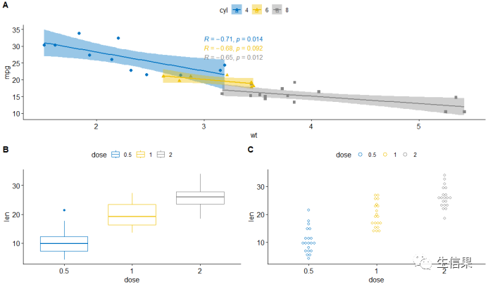
这样一来,一行中平均排行好,图片更加美观
但是有时候图片内容多了,会显得很拥挤,我们可以利用NULL构建空白图
我们这里示例一下边际密度图的散点图,去学习一下吧:
Scatter_plots <- ggscatter(iris, x = "Sepal.Length", y = "Sepal.Width",color = "Species", palette = "jco",size = 3, alpha = 0.6)+border()xplot <- ggdensity(iris, "Sepal.Length", fill = "Species",palette = "jco")yplot <- ggdensity(iris, "Sepal.Width", fill = "Species",palette = "jco")+rotate()yplot <- yplot + clean_theme()xplot <- xplot + clean_theme()ggarrange(xplot, NULL, Scatter_plots, yplot,ncol = 2, nrow = 2, align = "hv",widths = c(2, 1), heights = c(1, 2),common.legend = TRUE)

这样边际图周围留出来一些空白,我们可以将NULL套用在自己数据图中。
当然我们还可以添加统计的图表还有文本的信息,我们可以利用绘制变量“Sepal.Length” 的密度图以及描述性统计(mean,sd,…)的汇总表
# Sepal.Length密度图density.p <- ggdensity(iris, x = "Sepal.Length",fill = "Species", palette = "jco")# Sepal.Length描述性统计stable <- desc_statby(iris, measure.var = "Sepal.Length",grps = "Species")stable <- stable[, c("Species", "length", "mean", "sd")]# 设置table的主题stable.p <- ggtexttable(stable, rows = NULL,theme = ttheme("mOrange"))# text 信息text <- paste("iris data set gives the measurements in cm","of the variables sepal length and width","and petal length and width, reScatter_plotsectively,","for 50 flowers from each of 3 Scatter_plotsecies of iris.","The Scatter_plotsecies are Iris setosa, versicolor, and virginica.", sep = " ")text.p <- ggparagraph(text = text, face = "italic", size = 11, color = "black")# 组图展示,调整高度和宽度ggarrange(density.p, stable.p, text.p,ncol = 1, nrow = 3,heights = c(1, 0.5, 0.3))
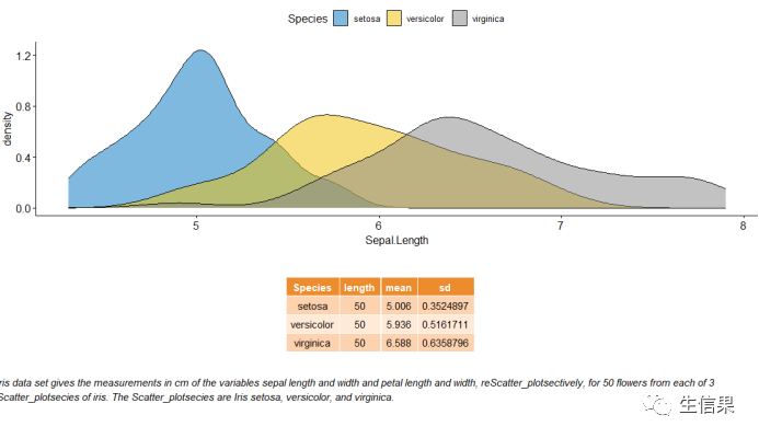
这样一来,下面就是对上述图的统计介绍,我们组合在一张图中。
我们在调整一下布局:进行#子母图展示
+ annotation_custom(ggplotGrob(stable.p),xmin = 5.5, ymin = 0.7,xmax = 8)#嵌套布局展示p1 <- ggarrange(Scatter_plots, Bar_plot + font("x.text", size = 9),ncol = 1, nrow = 2)p2 <- ggarrange(density.p, stable.p, text.p,ncol = 1, nrow = 3,heights = c(1, 0.5, 0.3))#先组合P1,P2,然后自定义行 列 ,嵌套组合展示p2, ncol = 2, nrow = 1)

这样是不是就大功告成了,小伙伴有没有心动呢,快去试试吧,不要忘记多多理解代码的意义,这样才能套用自己数据进行展示。
往期推荐

