奇思妙想,利用热图展示多种免疫浸润算法分析结果
点击蓝字
关注小图
今天小图为大家带来的分享灰常灰常有用,对于很多小伙伴来说,免疫浸润分析是非常熟悉的分析,该分析在生信文章中出现的频率很高,今天小图想利用pheatmap包对多种免疫浸润算法结果进行展示,非常值得小白学习,有需要的小伙伴可以跟着小图开始今天的学习,话不多说开始今天的分享。
1、准备需要的R包
#安装需要的R包BiocManager::install("pheatmap")install.packages(“tidyverse”)install.packages("RColorBrewer")install.packages("gplots")#加载需要的R包library(pheatmap)library(RColorBrewer)library(immunedeconv)library(tidyverse)library(gplots)
2、读取输入数据
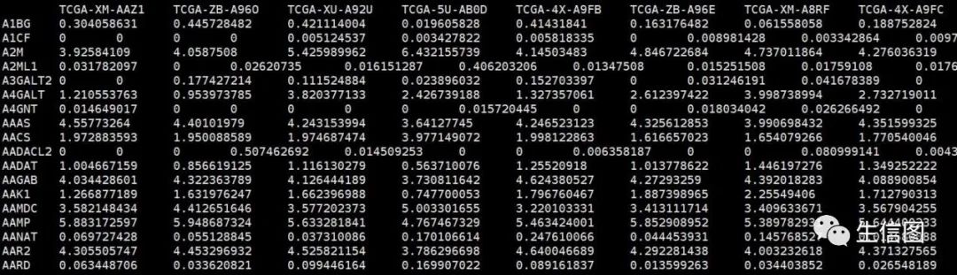
#EXP.txt基因表达矩阵,行名为基因名,列名为样本名dat <- read.table("EXP.txt",sep = "t",row.names = 1,header = T,stringsAsFactors = F,check.names = F)
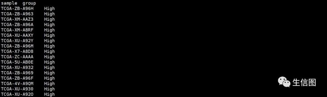
ann <- read.table("group.txt",sep = "t",header = T,stringsAsFactors = F,check.names = F)
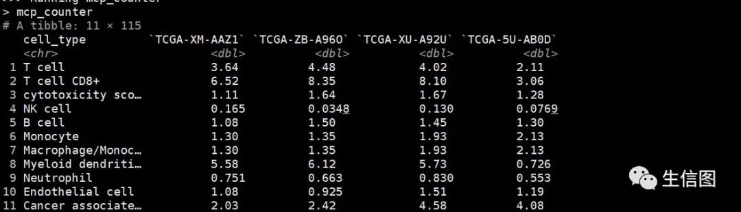
#利用xcell算法进行免疫浸润分析xcell<-immunedeconv::deconvolute(dat, "xcell")
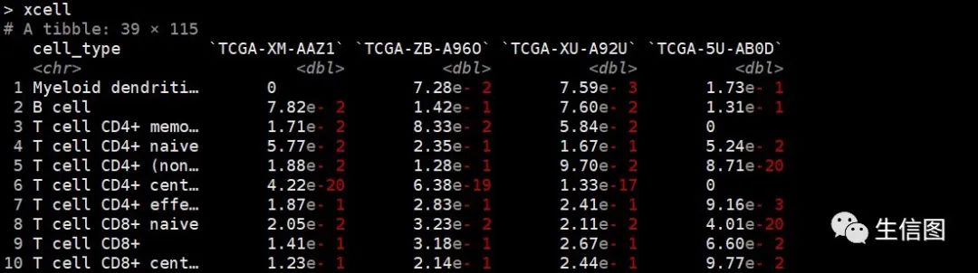
#将数据类型转化为数据框xcell<-as.data.frame(xcell)#添加免疫浸润算法名称xcell$cell_type<-paste0(xcell$cell_type,"_XCELL")#添加新的列名xcell$Immunemethod<-"XCELL"#利用epic算法进行免疫浸润分析epic<-immunedeconv::deconvolute(dat, "epic")
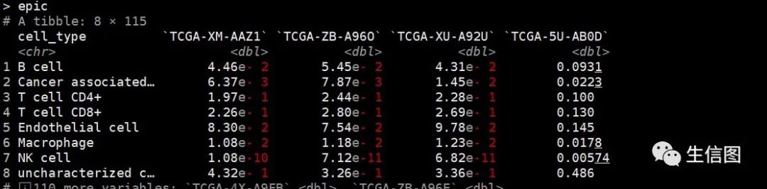
#将数据类型转化为数据框epic<-as.data.frame(epic)#添加免疫浸润算法名称epic$cell_type<-paste0(epic$cell_type,"_EPIC")#添加新的列名epic$Immunemethod<-"EPIC"#利用mcp_counter算法进行免疫浸润分析mcp_counter<-immunedeconv::deconvolute(dat,"mcp_counter")
#将数据类型转化为数据框mcp_counter<-as.data.frame(mcp_counter)#添加免疫浸润算法名称mcp_counter$cell_type<-paste0(mcp_counter$cell_type,"_MCPCOUNTER")##添加新的列名mcp_counter$Immunemethod<-"MCPCOUNTER"#合并xcell,epic和mcp_counter三种算法免疫细胞矩阵Immune<-rbind(xcell,epic,mcp_counter)#提取免疫细胞矩阵final<-select(Immune,-Immunemethod)#把列名改成行名final<-column_to_rownames(final,var="cell_type")#匹配高低风险组样本信息Immunesample<-match(ann$sample,colnames(final))final<-final[,Immunesample]# 定义颜色3.绘制免疫细胞热图methods.col <- brewer.pal(n = length(unique(Immune$immMethod)),name = "Paired")# 创建注释# 列注释,位于热图顶端annCol <- data.frame(RiskType = ann$group,# 以上是risk score和risk type两种注释,可以按照这样的格式继续添加更多种类的注释信息,记得在下面的annColors里设置颜色row.names = ann$sample,stringsAsFactors = F)# 行注释,位于热图左侧annRow<-data.frame(Methods=factor(Immune$Immunemethod,levels=unique(Immune$Immunemethod)),row.names = Immune$cell_type,stringsAsFactors = F)# 为各注释信息设置颜色annColors <- list(Methods = c("XCELL" = methods.col[1],"EPIC" = methods.col[2],"MCPCOUNTER" = methods.col[3]),# 下面是列注释的颜色,可依此设置更多注释的颜色"RiskType" = c("High" = "red","Low" = "blue"))# 数据标准化indata <- final[,colSums(final) > 0] # 确保没有富集全为0的细胞#确定免疫细胞含量范围standarize.fun <- function(indata=NULL, halfwidth=NULL, centerFlag=T, scaleFlag=T) {outdata=t(scale(t(indata), center=centerFlag, scale=scaleFlag))if (!is.null(halfwidth)) {outdata[outdata>halfwidth]=halfwidthoutdata[outdata<(-halfwidth)]= -halfwidth}return(outdata)}plotdata <- standarize.fun(indata,halfwidth = 2)pheatmap::pheatmap(mat = as.matrix(plotdata), # 标准化后的数值矩阵border_color = NA, # 无边框色color = bluered(64), # 热图颜色为红蓝cluster_rows = F, # 行不聚类cluster_cols = F, # 列不聚类show_rownames = T, # 显示行名show_colnames = F, # 不显示列名annotation_col = annCol, # 列注释annotation_row = annRow, # 行注释annotation_colors = annColors, # 注释颜色gaps_col = table(annCol$RiskType)[2], # 列分割gaps_row = cumsum(table(annRow$Methods)), # 行分割cellwidth = 0.8, # 元素宽度cellheight = 10, # 元素高度filename = "immune_heatmap_by_pheatmap.pdf")#保存图片
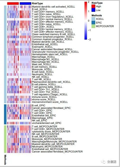
最终小图成功的对多种免疫浸润算法结果通过热图的形式展示出来,看起来图片效果非常不错,欢迎大家和小图一起讨论学习呀!

免疫浸润相关分析内容,例如单样本富集算法分析免疫浸润丰度(http://www.biocloudservice.com/106/106.php),计算64种免疫细胞相对含量(http://www.biocloudservice.com/107/107.php),panImmune免疫浸润分析(http://www.biocloudservice.com/782/782.php)等都可以用本公司新开发的零代码云平台生信分析小工具,一键完成该分析奥,感兴趣的小伙伴欢迎来尝试奥,网址:http://www.biocloudservice.com/home.html。今天小图的分享就到这里,下期在见奥。
欢迎使用:云生信平台 ( http://www.biocloudservice.com/home.html)

|
往期推荐 |
|
|
|
|
|
|
👇点击阅读原文进入网址